
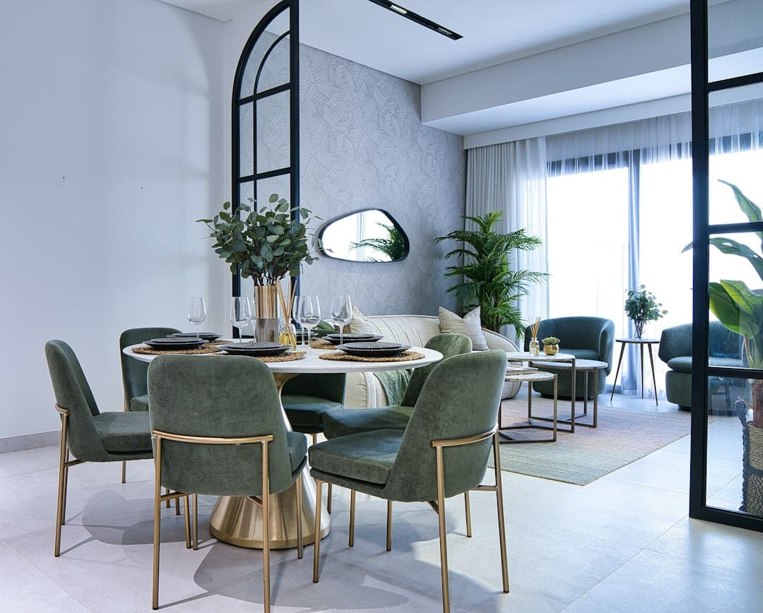
Color choice directly influences how expensive a Dubai apartment appears. Neutral tones like soft grays, warm whites, and champagne create a premium backdrop that highlights architecture and finishes, while deep jewel tones and muted earth tones add sophistication without overwhelming the space. The most expensive-looking apartments avoid bold or overly saturated colors in favor of restrained palettes that allow quality lighting, high-end furnishings, and architectural details to command attention. Strategic color layering—combining a neutral base wall with accent colors through curated furnishings and art—amplifies perceived value far more effectively than painting all walls in a signature color.
Why Color Matters More Than You Think
When you walk into a Dubai apartment, your brain makes an instant judgment about quality and value. Color is one of the first visual signals your mind processes, and it silently communicates either "luxury" or "budget" before you've even registered the furniture or finishes. A well-chosen color palette can make a AED 600,000 apartment feel worth AED 800,000, while the wrong color can make premium finishes look ordinary.
The psychology is straightforward: expensive spaces don't compete for attention through bold color. Instead, they create a calm, curated environment where every element—lighting, art, furnishings, views—can be appreciated individually. This restraint signals wealth and confidence, whereas loud colors suggest the need to compensate for missing elements.
Neutral Tones: The Foundation of Luxury
Soft grays, warm whites, and muted beiges form the backbone of every high-end Dubai apartment. These colors work because they're genuinely neutral—they don't fight with natural light changes throughout the day, they complement any architectural style, and they provide a professional backdrop for premium furnishings and art.
Warm Whites and Creams
Pure white can feel clinical in Dubai's intense sunlight. Instead, luxury apartments use warm whites—whites with subtle undertones of cream, champagne, or soft gray. These shades prevent the harsh, sterile appearance that pure white can create, while still maintaining an open, airy feeling. Think of the interiors in how professional interior designers approach Dubai apartments—they rarely use stark whites.
Soft Grays and Greiges
Soft gray (particularly in the LRV range of 50-65, which measures light reflectance value) has become the signature color of luxury Dubai interiors. Greige—a blend of gray and beige—offers warmth without being yellow-toned. These colors work beautifully with Dubai's abundant natural light and expensive finishes like marble, stainless steel, and natural wood.
Champagne and Taupe
Champagne tones (very soft, warm golds with gray undertones) create a sense of subtle luxury without the dated appearance of yellow or golden beiges. Taupe—a cool brown-gray—provides depth while remaining neutral enough to pair with virtually any furnishing style or accent color.
Deep Jewel Tones: Adding Sophistication
While neutral walls are essential, luxury apartments often introduce sophisticated depth through accent colors in specific, controlled ways. Deep jewel tones—emerald green, sapphire blue, rich navy, and burgundy—signal elegance and expense when used strategically rather than covering entire rooms.
Emerald Green Accents
Emerald green (a deep, muted green with blue undertones) appears frequently in high-end Dubai residences, typically on a single accent wall, kitchen cabinetry, or as part of built-in shelving. It pairs beautifully with warm white trim and metallic accents. The key is saturation: a deep, muted emerald looks expensive; a bright, neon-toned green looks cheap.
Navy and Sapphire Blue
Deep navy blue conveys formality and expense. High-end Dubai apartments sometimes feature navy accent walls in studies or feature walls in master bedrooms, paired with brass or gold fixtures and warm white trim. Sapphire blue is slightly more playful but equally luxurious when applied with restraint.
Burgundy and Maroon
Rich burgundy or maroon can create an extremely sophisticated interior when applied selectively—perhaps as a powder room accent or a single feature wall. These colors must be genuinely deep and muted; bright reds or orange-toned reds read as inexpensive.
Earth Tones: Warmth Without Loudness
Muted earth tones—soft terracotta, warm ochre, dusty sienna—have gained traction in Dubai's contemporary luxury interiors, particularly inspired by 2026 interior design trends emphasizing warm minimalism and biophilic design. These colors work because they're warm (avoiding the sterile feel of cool grays) while remaining restrained and sophisticated.
The crucial distinction: these must be deeply muted. A bright terracotta or saturated ochre reads as casual or eclectic; a soft, dusty version of the same hue appears intentional and curated. Think of the faded earth tones you'd see in high-end Italian or Moroccan design, not vibrant decorator colors.
The Colors That Scream Budget (And Why)
Certain colors consistently make apartments look less expensive, regardless of their square footage or actual finishes. Understanding why helps explain the principle behind luxury color choice.
- Bright, saturated colors (neon green, electric blue, hot pink)—These signal impulsivity and trend-chasing, not thoughtful curation.
- Orange and golden yellows—These warm tones can read as dated, cheap, or overwhelming in residential spaces. They also compete with Dubai's natural golden sunlight rather than complementing it.
- High-contrast, busy patterns—Busy wallpapers, stripes, and geometric patterns make rooms feel smaller and less cohesive, even if the pattern itself is well-designed.
- Mismatched or too-many neutrals—Combining multiple different neutral tones (warm beige walls, cool gray furniture, yellow-white trim) creates visual discord that reads as indecisive rather than curated.
- Flat, matte finishes on cheap paint—Premium apartments use high-quality paint with sophisticated finishes (soft eggshell or satin) that reflect light subtly, whereas budget paint in flat matte appears dull and flat.
Light, Finish, and Application Matter as Much as Color
The color itself is only part of the equation. How that color interacts with light, its finish, and how it's applied dramatically changes its perceived value. A "luxury gray" applied in flat matte with poor coverage looks cheap; the same gray in high-quality paint with a soft satin finish looks expensive.
Natural Light Reflection
Dubai's intense sunlight is a design asset. Luxury apartments in Dubai maximize this by choosing colors that work with, not against, the light. Soft grays, warm whites, and muted earth tones all reflect light beautifully and create a luminous, expensive appearance. Colors that absorb too much light (very dark, saturated tones) can make rooms feel smaller and cave-like, unless deliberately designed as intimate accent walls.
Paint Quality and Finish
Luxury apartments use premium paint—typically in soft eggshell or satin finishes that reflect light subtly without being glossy. The finish creates depth and sophistication that flat, budget paint cannot achieve, regardless of color choice. This is why professional interior designers recommend investing in quality paint as a foundational element.
Color Coordination with Furnishings and Finishes
A color only looks expensive if it's coordinated thoughtfully with everything else in the space. This is why luxury apartments spend time on color theory and curation rather than painting walls based on personal whim.
Metallic Accents and Hardware
Cool-toned neutrals (soft grays, cool whites) pair beautifully with chrome, stainless steel, and silver fixtures. Warm neutrals (champagne, warm whites, soft taupes) complement brass, gold, and rose gold finishes. Mixing metallics is acceptable in luxury spaces, but each should appear intentional rather than accidental.
Flooring and Large Surfaces
Wall color should complement, not compete with, flooring. Light gray walls work beautifully with warm wood or light marble; warm champagne walls complement cooler-toned marble or light wood. The goal is visual harmony rather than contrast.
Artwork and Textiles
High-end apartments use wall color as a backdrop for curated art and furnishings. A soft gray or warm white wall allows artwork, cushions, throws, and decorative objects to take center stage. Conversely, a bold accent wall demands that furnishings coordinate with it, which requires more intentional (and expensive) curation.
When Buyers Are Furnishing on a Budget
If you're buying a new Dubai apartment and furnishing on a limited budget, color strategy becomes even more important. Budget furnishing guides recommend using neutral wall colors as a foundation precisely because neutral walls allow affordable furnishings to look more expensive through visual simplicity and focus.
A plain AED 800 sofa on a soft gray wall looks far more curated and expensive than the same sofa against a bold accent wall, because the neutral background doesn't distract from or compete with the furnishing itself.
The Strategic Approach Used by Professional Designers
Professional interior designers in Dubai apply a consistent formula: neutral base (60-70% of visible surfaces), secondary neutral or muted tone (20-30%), and then reserved accent colors (5-10% maximum, typically through furnishings and art rather than paint). This layered approach maximizes perceived luxury while remaining flexible and timeless.
The same strategy that works in Downtown Jebel Ali luxury apartments works equally well in emerging communities—because the principle of restraint and curation transcends price point. It's about how you use color, not the cost of the paint itself.
Conclusion: Expensive-Looking Color Is About Restraint, Not Boldness
The color that makes a Dubai apartment look most expensive is usually the one you notice least. Soft grays, warm whites, champagne, and muted earth tones create a backdrop so refined that attention flows naturally to lighting, architecture, furnishings, and views—the elements that genuinely signal wealth and quality.
Deep jewel tones, when used strategically as accents rather than dominant colors, add sophistication without overwhelming the space. The principle behind all luxury apartment color choice is the same: restraint and intentionality communicate expense far more effectively than boldness and saturation.
If you're planning to buy or rent a Dubai apartment and want guidance on design, finishes, or total cost of ownership—including paint, furnishings, and DLD registration fees—connect with Immoworld DXB's advisory team. We help buyers navigate not just the purchase process, but the practical reality of settling into their new space with confidence and clarity.